Typography Essentials for Legal Professionals
Master typography to enhance readability, professionalism, and persuasive power in legal documents and communications.
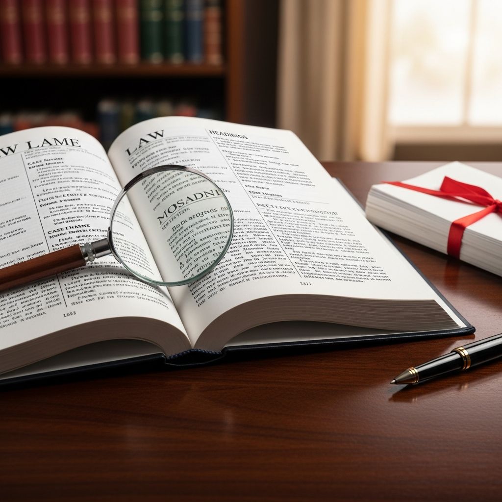
Typography forms the foundation of effective legal communication, influencing how judges, clients, and opposing counsel perceive and process your arguments. Beyond mere aesthetics, thoughtful typographic decisions enhance readability, convey authority, and strengthen persuasive impact in everything from appellate briefs to client correspondence.
The Critical Role of Typography in Legal Practice
Legal documents demand precision not only in content but also in presentation. Poor typography can undermine even the strongest case by distracting readers or obscuring key points. Courts increasingly scrutinize formatting, with some providing detailed guidelines on typefaces and layout to ensure clarity. Professional typography aligns legal writing with standards used in high-quality published materials, signaling competence and respect for the audience.
Typography affects comprehension speed and retention. Studies and expert analyses show that well-chosen fonts and spacing reduce cognitive load, allowing readers to focus on substance rather than struggling with the form. For lawyers, this means briefs that persuade more effectively and memos that impress partners.
Selecting the Right Fonts for Court Filings and Documents
Choosing appropriate fonts is paramount in legal work, where legibility under time pressure is essential. Serif fonts, characterized by small decorative strokes at letter ends, excel in long-form texts like briefs because they guide the eye smoothly across lines. Recommended options include Century Schoolbook and Bookman Old Style, favored for their taller x-heights—the height of lowercase letters—which improve readability compared to fonts like Garamond or Times New Roman.
Sans-serif fonts, lacking these strokes, work well for headings or digital viewing, providing crisp contrast. Avoid novelty fonts like Comic Sans, which courts have mocked for appearing unprofessional. Court rules often specify requirements; for instance, the Seventh Circuit’s handbook dedicates pages to font selection, emphasizing book-suited typefaces.
| Font Family | Best Use | Key Advantages | Court Recommendations |
|---|---|---|---|
| Serif (e.g., Century Schoolbook) | Body text in briefs | High x-height, easy for long reading | Preferred by 7th Circuit |
| Serif (e.g., Times New Roman) | General documents | Classic, widely available | Common but not ideal |
| Sans-serif (e.g., Helvetica) | Headings, emails | Screen-readable, modern | For contrast |
| Avoid: Comic Sans | None | Informal, distracting | Criticized in opinions |
Font size should minimum 12 points, ideally 14 for screen reading, per common court rules and best practices.
Optimizing Line Spacing and Length for Maximum Readability
Line spacing, or leading, profoundly impacts document flow. Ideal spacing is 120-145% of font size—for 12-point text, 14.4 to 17.4 points—creating breathing room without looseness. Courts often mandate single or double spacing, but subtle adjustments like 1.15x improve aesthetics when allowed.
Line length matters equally: aim for 45-90 characters per line to prevent eye fatigue. Wider margins help achieve this outside strict court formats. Justified alignment requires hyphenation to avoid rivers of white space; left-aligned is simpler and often preferred.
- Use 1.15-1.5x line spacing for open, readable text.
- Limit lines to 70 characters max in memos.
- Enable hyphenation with justified text.
- Opt for smaller paragraph indents (0.25-0.5 inches) over deep ones.
Mastering Emphasis: Bold, Italics, and Avoiding Underlining
Emphasis tools must enhance without overwhelming. Use bold for strong highlights and italics for subtler stress in serif fonts; sans-serif favors bold only. Underlining, a typewriter relic, disrupts flow and is obsolete in digital documents.
Reserve all caps for true acronyms—prolonged use slows reading like italics. In sans-serif contexts, slanted italics may not stand out, so bold suffices.
Punctuation and Composition Best Practices
Fine details elevate professionalism. Employ curly quotes (“ ”) over straight (“), one space after periods, and proper dashes: en-dash (–) for ranges, em-dash (—) for interruptions. Paragraph (§) and section symbols require accurate rendering.
- One space post-period: Modern standard, reduces clutter.
- Curly quotes: Sophisticated appearance.
- Dashes: Hyphen (-), en (–), em (—) each have roles.
- Ampersands (&): Limit to headings or firm names.
Nonbreaking spaces prevent awkward breaks in signatures or measurements. Ligatures (e.g., fi) activate in quality fonts for smoother reading.
Leveraging White Space and Document Layout
White space is not empty—it’s essential for legibility. Follow the 50% rule: no more than half a page in text, balancing margins and inter-paragraph gaps. Indent quoted statutes single-spaced for contrast.
Headings in contrasting fonts (sans-serif on serif body) guide navigation. Balanced pages with ample margins foster a professional rhythm akin to published books.
Typography in the Digital Age: Screens and Branding
With legal work increasingly digital, fonts must perform on screens. Sans-serifs shine here, but versatile serifs like Equity (designed for lawyers) bridge print and pixel. Align firm branding: consistent fonts in letters, websites, and docs build trust.
Clients engage more with polished, readable materials. Moving beyond defaults like Times signals modernity and detail orientation.
Resources and Court-Specific Guidelines
Matthew Butterick’s Typography for Lawyers is indispensable, offering rules for polished documents. Consult court handbooks—e.g., Seventh Circuit’s extensive font section. Fonts like Equity provide attorney-tailored alternatives.
Frequently Asked Questions
What is the best font size for legal documents?
Minimum 12 points, preferably 14 for enhanced screen readability, unless court rules specify otherwise.
Should lawyers use one or two spaces after periods?
One space is the typographic standard, promoting clean lines.
Is Times New Roman always appropriate for briefs?
It’s acceptable but consider alternatives like Century for better x-height and readability.
How do I handle emphasis in legal writing?
Prefer bold and italics over underlining; use sparingly for impact.
What line length optimizes reading?
45-90 characters, achievable with adjusted margins.
References
- Not Just a Matter of Looking Pretty—Why Typography Matters in Legal Writing — MTFN. Accessed 2026. https://www.mtfn.com/not-just-a-matter-of-looking-pretty-why-typography-matters-in-legal-writing/
- The Art of Typography: A Guide for Lawyers — Oreate AI Blog. 2024-09-12. https://www.oreateai.com/blog/the-art-of-typography-a-guide-for-lawyers/65f335c548d9ebefe50a4a50000f8bb3
- A Guide to the Best Fonts for Legal Documents — Clio. Accessed 2026. https://www.clio.com/blog/legal-fonts-for-legal-documents/
- Advancing the Legal Profession with Typography — The Florida Bar Journal. Accessed 2026. https://www.floridabar.org/the-florida-bar-journal/advancing-the-legal-profession-with-typography/
- Typography for Lawyers — Marquette Law School Faculty Blog. 2011-11. https://law.marquette.edu/facultyblog/2011/11/typography-for-lawyers/
- Typography: A Simple Guide for Judges — Judicature (Duke University). Accessed 2026. https://judicature.duke.edu/articles/typography-for-judges/
- Typography for Lawyers — Typography for Lawyers. Accessed 2026. https://typographyforlawyers.com
- Typography for Lawyers: One Space, Double Spacing, and other go — Ben Carter Law Blog. 2012-05-19. http://www.bencarterlaw.com/blog/2012/5/19/typography-for-lawyers-one-space-double-spacing-and-other-go.html
Similar Articles





Read full bio of Sneha Tete