Logo Psychology: Shaping Brand Perception
Unlock how logo elements like shapes, colors, and dynamics influence consumer emotions, trust, and loyalty in profound ways.
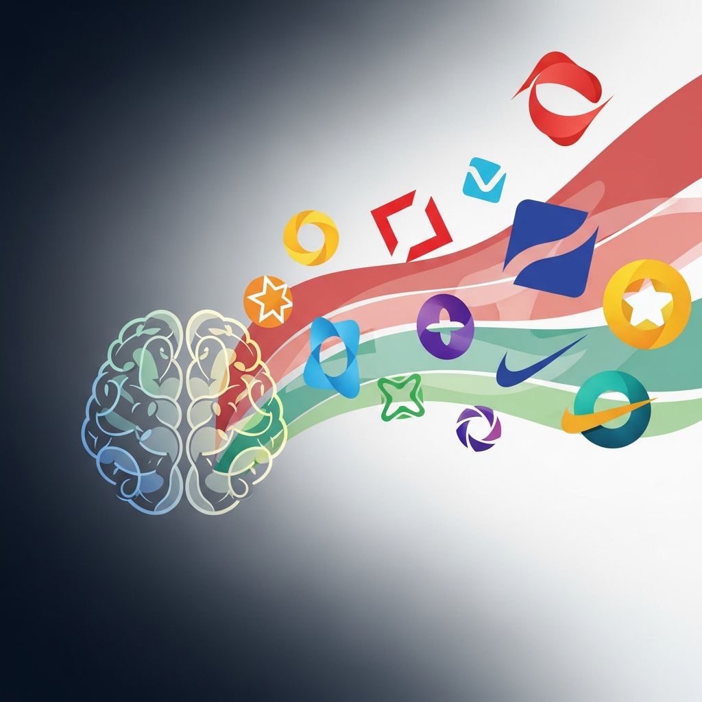
Logos serve as the visual cornerstone of a brand’s identity, silently communicating values, personality, and promises to consumers in mere moments. Scientific research reveals that the human brain processes these designs in as little as 400 milliseconds, triggering emotional responses and shaping purchasing decisions based on prior experiences and innate psychological cues. This article delves into the fascinating interplay between logo elements and consumer minds, drawing from neuromarketing studies and psychological experiments to explain why certain designs build trust, evoke loyalty, and drive success.
The Instant Impact: How Brains Process Logos
From the moment a logo enters our field of vision, neural pathways activate, linking shapes, colors, and forms to deep-seated associations. A landmark neuromarketing study using AI-powered eye-tracking, EEG, and cognitive surveys on 297 participants demonstrated that dynamic logo elements—those with motion-implying curves or bold icons—capture attention longer and foster stronger emotional bonds than static counterparts. Participants showed heightened engagement scores, with dynamic designs maintaining viewer focus for extended periods, leading to superior brand recall.
This rapid processing isn’t random; it’s rooted in evolutionary psychology. Our brains favor familiar, simple patterns for quick threat assessment and reward prediction. Brands leveraging this—through clean lines and balanced compositions—elicit positive emotions tied to self-esteem and pleasure centers in the brain. Conversely, overly complex logos increase cognitive load, potentially overwhelming viewers and diluting impact, as evidenced by EEG readings linking higher cognitive demand to both challenge and deeper emotional investment when executed well.
Shapes That Speak: Angular vs. Rounded Influences
Shape is perhaps the most primal element in logo psychology, evoking tangible qualities like softness or strength. A comprehensive study across five experiments, published in the Journal of Consumer Research, found that rounded logos trigger perceptions of warmth, comfort, and empathy. Consumers rated products with circular designs as more caring and customer-focused, associating curves with gentleness—ideal for brands in healthcare, childcare, or hospitality.
| Shape Type | Psychological Associations | Ideal Brand Types | Research Evidence |
|---|---|---|---|
| Rounded/Circular | Warmth, softness, approachability | Consumer goods, services, nonprofits | Higher comfort ratings; activates ‘softness’ neural links |
| Angular/Sharp | Strength, durability, aggression | Tech, finance, automotive | Perceived as more robust; influences durability judgments |


The Future of AI: Preventing a Big Tech Monopoly >

Angular logos, by contrast, convey power and reliability. The same research showed they enhance views of product toughness and company competence, particularly when visual working memory is unburdened—meaning simple, memorable shapes amplify these effects. For instance, tech giants often employ sharp edges to signal innovation and precision, aligning with audience expectations for cutting-edge performance.
These associations extend beyond products to corporate traits. Rounded forms suggest generous customer service, while sharp ones imply efficient, no-nonsense operations. Designers must align shapes with brand narratives to avoid dissonance, which can erode trust subconsciously.
Color’s Emotional Palette: Evoking Trust and Urgency
Colors bypass rational thought, directly stimulating the limbic system—the brain’s emotion hub. Blues dominate finance and tech logos for their calming, trustworthy aura, reducing perceived risk in high-stakes decisions. Reds ignite urgency and passion, perfect for food or entertainment, but risk evoking danger if overused.
- Blue: Stability, professionalism—used by 33% of top brands for trust-building.
- Green: Growth, health—aligns with eco-friendly or wellness sectors.
- Yellow: Optimism, energy—sparks attention but can signal caution.
- Black: Luxury, authority—conveys premium quality.
- Orange: Creativity, enthusiasm—drives calls to action.
Research confirms these links are universal yet culturally nuanced; for global brands, testing across demographics ensures resonance. Emotional arousal from color boosts aesthetic appeal and recall, with familiar palettes yielding faster, more positive reactions.
Dynamic vs. Static: Boosting Engagement and Recall
In an era of fleeting attention spans, dynamic elements—implied motion through swooshes or gradients—outperform static designs. Neuroscientific analysis revealed dynamic logos score higher in saliency maps, total attention time, and emotional positivity. Luxury brands benefit immensely, as these elements signal sophistication and modernity, aligning with consumer self-image.
Yet dynamism demands balance; excessive motion fatigues viewers. Studies of 597 logos highlight that iconic, simple designs with subtle dynamics achieve peak effectiveness, differentiating from competitors while embedding in long-term memory. Verbal elements, like stylized text, further amplify this by merging cognitive processing with rapid iconic recall, enhancing overall resonance.
Simplicity Wins: Lessons from 597 Logos
A Harvard Business Review analysis of 597 logos underscores simplicity as the gold standard for recognition and investor appeal. Spiky or overly detailed designs confuse, while clean icons facilitate instant differentiation. This aligns with brain science: simple logos reduce cognitive dissonance, freeing mental resources for positive associations.
Brand familiarity compounds this; repeated exposure shortens response times and heightens emotional positivity. Emerging brands should prioritize timeless minimalism to scale effectively across mediums—from billboards to apps.
Understanding Your Audience: Tailoring Visual Identity
No logo succeeds in isolation; it must mirror audience values. Psychological principles guide this: serious demographics favor authoritative designs, while youthful ones crave playful energy. Research emphasizes self-congruence—logos reflecting user identity foster loyalty.
Define your demographic first: age, values, pain points. A fintech app for millennials might blend angular tech shapes with vibrant accents, signaling innovation with approachability. Test iteratively using eye-tracking or surveys to validate emotional fit.
Building Emotional Bridges: From Logo to Loyalty
Logos transcend visuals; they forge emotional ties pivotal for loyalty. Studies link emotional engagement to reputation and purchase intent, with dynamic, resonant designs outperforming. By evoking needs—like security via blue rounds or excitement via red dynamics—brands cultivate belonging.
Emotional branding thrives on authenticity; misaligned cues breed skepticism. Integrate logos into holistic identities—packaging, ads, experiences—for compounded impact.
Practical Strategies for Logo Optimization
- Research-Driven Design: Employ neuromarketing tools pre-launch to measure attention and emotion.
- A/B Testing: Compare shape/color variants for audience-specific responses.
- Versatility Check: Ensure scalability in black/white, small sizes, digital/print.
- Evolution Planning: Allow subtle refreshes to stay relevant without alienating fans.
- Legal Safeguards: Trademark early to protect unique psychology-driven elements.
Collaborate with designers versed in psychology for grounded, effective outcomes.
Frequently Asked Questions
What makes a logo psychologically effective?
A psychologically effective logo uses simple shapes, resonant colors, and dynamic elements to evoke trust, emotion, and recall, backed by brain response data.
Should logos always be simple?
Yes, simplicity aids recognition and memory; complex designs increase cognitive load without proportional benefits.
How do colors affect brand perception?
Colors trigger subconscious emotions—blue for trust, red for energy—guiding decisions irrationally yet powerfully.
Can logo shapes influence sales?
Absolutely; rounded shapes boost ‘comfort’ perceptions, angular ones ‘durability,’ directly impacting product judgments.
Why test logos with neuroscience?
Neuroscience uncovers implicit reactions self-reports miss, predicting real-world engagement and loyalty.
References
- Neuroscientific Analysis of Logo Design: Implications for Luxury… — PMC/NCBI. 2024. https://pmc.ncbi.nlm.nih.gov/articles/PMC12024241/
- How Your Brain “Sees” A Logo, According To Science — Digital Synopsis. 2023. https://digitalsynopsis.com/design/how-your-brain-sees-a-logo/
- The Shape of a Logo Has a Powerful Impact on Consumers — Association for Psychological Science. 2013-12-09. https://www.psychologicalscience.org/news/minds-business/the-shape-of-a-logo-has-a-powerful-impact-on-consumers120911.html
- The Psychology of Logo Design: How Basic Design Principles Can… — VistaPrint. 2024. https://www.vistaprint.com/hub/psychology-of-logo-design
- A Study of 597 Logos Shows Which Kind Is Most Effective — Harvard Business Review. 2019-09. https://hbr.org/2019/09/a-study-of-597-logos-shows-which-kind-is-most-effective
Similar Articles







Read full bio of Sneha Tete