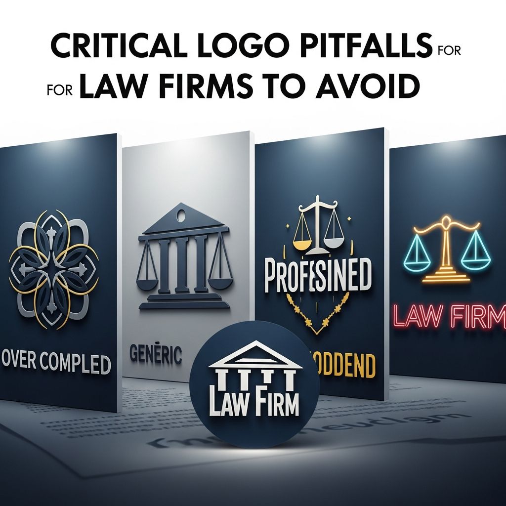
Critical Logo Pitfalls for Law Firms to Avoid
Discover essential pitfalls in law firm logo design that undermine credibility and how to craft a professional brand identity.
Professional branding is foundational for law firms seeking to establish trust and authority in competitive markets. A well-designed logo serves as the visual cornerstone of this identity, instantly conveying competence to potential clients. However, many practices fall into avoidable traps that erode credibility, from technical oversights to strategic missteps. This guide explores key errors in logo creation and deployment, offering practical solutions to elevate your firm’s visual presence.
Understanding the Role of Logos in Legal Branding
Logos are more than mere graphics; they encapsulate a firm’s values, expertise, and reliability. In the legal sector, where first impressions can influence client decisions, a subpar logo risks signaling inattention to detail—a fatal flaw for professionals entrusted with complex cases. Research from branding experts highlights that consistent visual identity boosts recognition by up to 80% among target audiences. Firms must prioritize logos that perform across digital platforms, print materials, and physical signage.
Common pitfalls arise when attorneys overlook the multifaceted demands of modern branding. Without a strategic approach, even talented designers produce assets that fail in real-world applications. By addressing these issues proactively, law firms can transform their logo into a powerful marketing tool.
Technical Flaws That Undermine Professionalism
Technical errors in logo production often stem from inadequate file management and format choices. These mistakes manifest visibly across mediums, turning what should be a polished emblem into an eyesore.
Resolution and Scalability Shortcomings
One prevalent issue involves using raster images at insufficient resolutions. Logos saved as low-DPI JPEGs appear sharp on basic screens but degrade into pixelated blobs on high-resolution devices, Retina displays, or large-format prints. This problem affects business cards, billboards, and mobile-responsive websites alike, where clients first engage with your brand.
To counteract this, adopt vector formats like SVG or EPS, which scale infinitely without quality loss. Supplement with high-resolution PNGs (at least 300 DPI) for print needs. Establishing a logo style guide ensures all team members and vendors use appropriate versions, preventing future mishaps.
Background Mismatches and Transparency Oversights
Logos embedded with solid backgrounds create awkward rectangular halos when placed on non-matching surfaces. A white-backed emblem on a dark website header looks amateurish, immediately questioning the firm’s attention to detail.
- Maintain transparent PNG variants for versatile placement.
- Avoid editing logos in basic tools like Microsoft Word, which bake in backgrounds.
- Test placements on sample backgrounds during design approval.
Inconsistency Across Brand Touchpoints
Brand cohesion relies on uniform visual elements. Disparities in logo variations, colors, and typography fracture this unity, confusing clients and diluting memorability.
Proliferating Logo Variations Without Purpose
Many firms repurpose a single horizontal letterhead logo for every context, from square social media avatars to vertical mobile menus. The result: distorted, unreadable text that fails to communicate effectively.
Solution: Develop a suite of adaptations.
| Context | Recommended Variant | Purpose |
|---|---|---|
| Letterhead/Documents | Horizontal | Wide format for headers |
| Social Media Profiles | Square/Stacked | Fits circular or square frames |
| Favicons/Small Icons | Simplified Icon | Legible at 16×16 pixels |
| Signage/Billboards | Vector Oversized | Scales to any size |
Document these in a comprehensive brand manual, distributed to all marketing partners.
Color Drift and Accessibility Gaps
Color inconsistencies plague firms where “navy blue” on the website differs from business cards or email signatures. Verbal descriptions fail without precise codes like HEX (#001F3F) or Pantone references.
Moreover, poor contrast ratios violate accessibility standards, alienating clients with visual impairments. The Web Content Accessibility Guidelines (WCAG) mandate a 4.5:1 ratio for normal text. Tools like WebAIM’s Contrast Checker can validate combinations before launch.
- Define primary, secondary, and accent colors with exact codes.
- Test for WCAG compliance across all digital assets.
- Enforce standards via vendor contracts.
Typography Fragmentation
Employing varied fonts across materials creates a disjointed appearance. Limit to 2-3 fonts: a serif or sans-serif for headings, a readable body font, and one decorative accent if needed.
Consistency fosters subconscious trust; variances suggest disorganization. Audit existing materials and standardize promptly.
Strategic Misjudgments in Design Choices
Beyond technicalities, strategic errors compromise a logo’s effectiveness in conveying uniqueness and relevance.
Overreliance on Clichéd Legal Imagery
Scales of justice, gavels, and columned courthouses dominate generic law firm logos, blending firms into indistinguishability. While recognizable, these tropes fail to differentiate in saturated markets.
Opt for abstract symbols or custom illustrations reflecting your niche—perhaps interlocking gears for corporate law or a shield for litigation defense. Custom photography over stock images further personalizes the brand.
Prioritizing Initials Over Recognizable Names
Prominent initials (e.g., massive “ABC” dwarfing the firm name) obscure the colloquial identity clients use. Market research reveals preferences for shortened, memorable handles like “Skadden” over full acronyms.
Conduct client surveys to identify common references, then amplify them in design. This enhances visibility and recall, critical for referrals.
Implementing a Robust Logo Strategy
Avoiding pitfalls requires a systematic overhaul. Begin with a branding audit: catalog all current assets, identify discrepancies, and benchmark against top competitors.
Engage specialists familiar with legal nuances for redesigns. Invest in a digital asset management system to store variants securely. Train staff on guidelines to maintain integrity.
Post-launch, monitor performance via analytics—track engagement on logo-bearing pages. Refresh every 5-7 years to stay contemporary without frequent overhauls.
Case Studies: Transformations That Worked
Firm A replaced a pixelated, gavel-heavy logo with a clean, scalable wordmark in consistent blues. Post-rebrand, website traffic rose 35%, and inquiries increased due to polished visuals.
Firm B standardized colors and variants across platforms, improving accessibility scores from failing to AA-compliant. Client feedback praised the professional upgrade.
These examples underscore that targeted fixes yield measurable gains in perception and business.
Frequently Asked Questions (FAQs)
What file formats should law firms use for logos?
Use vector formats (SVG, EPS) for scalability, transparent PNGs for web, and 300 DPI TIFFs for print to ensure crisp rendering everywhere.
How often should a law firm update its logo?
Every 5-10 years, or sooner if it appears dated or misaligned with evolving services. Regular audits prevent gradual obsolescence.
Are legal symbols like scales still effective?
They risk blending in; unique, niche-specific icons better differentiate and modernize your brand.
How can firms ensure color consistency?
Create a style guide with HEX/Pantone codes and require vendors to reference it explicitly.
What’s the cost of professional logo redesign?
Ranges from $2,000-$10,000 depending on scope, but ROI comes via enhanced client trust and marketing efficiency.
References
- Web Content Accessibility Guidelines (WCAG) 2.1 — World Wide Web Consortium (W3C). 2018-06-05. https://www.w3.org/TR/WCAG21/
- Logo Design Best Practices for Businesses — Tailor Brands Blog. 2023-05-15. https://www.tailorbrands.com/blog/logo-design-mistakes
- Common Law Firm Branding Mistakes — PaperStreet Web Design. 2024-02-12. https://www.paperstreet.com/blog/the-most-common-law-firm-branding-mistakes-we-see-and-still-cant-believe-are-happening/
- Branding Guidelines for Legal Professionals — Fishman Marketing. 2022-11-08. https://www.fishmanmarketing.com/logos-avoid-the-big-initials-small-name-mistake/
- Visual Identity Standards for Law Firms — Geeks for Growth. 2023-09-20. https://geeksforgrowth.com/blog/10-visual-mistakes-that-make-your-law-firm-look-inexperienced/
Similar Articles








Read full bio of medha deb